
HeroUI v2.7.0
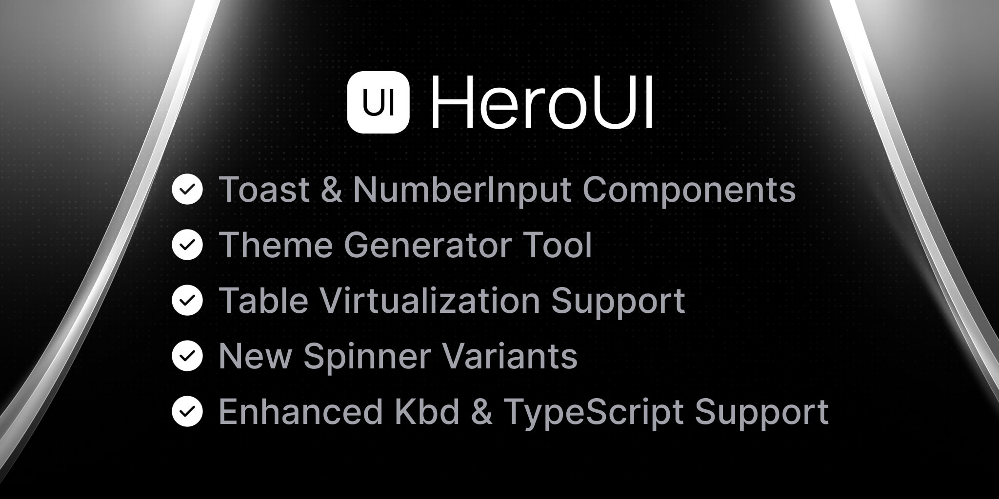
HeroUI version v2.7.0 introduces the highly anticipated Toast component, along with exciting new features including NumberInput component, Theme Generator, new Spinner variants, Table virtualization support, and numerous improvements and bug fixes.
What's New in v2.7.0?
- Toast Component - A new toast notification system with rich features
- NumberInput Component - A new input component specifically designed for numerical values
- New Spinner Variants - Enhanced spinner component with new design variants
- Theme Generator - A powerful web-based tool for creating and customizing your themes
- Table Virtualization - Performance improvements for large datasets in Table component
- New Global Props - New global configuration options for label placement and spinner variant
- Keyboard Support - Enhanced keyboard support with fn, win, and alt keys
- Type Improvements - Better TypeScript support and exported types
- What's Next? - Upcoming features and improvements
- Breaking Changes - Important changes that may affect existing implementations
- Release Changes - Detailed list of features, documentation updates, bug fixes and enhancements
Upgrade today by using one of the following methods:
- Upgrading HeroUI using the
cli
- Upgrading HeroUI using package managers
Toast Component
The new Toast component provides a flexible and accessible way to show temporary notifications in your application. It comes with built-in support for different placements, variants, and animations. Inspired by Sonner, our Toast component brings a beautiful, minimal, and customizable notification system to HeroUI.
Setup
First, add the ToastProvider to your application:
Basic Usage
Features
- Multiple placement options (top, bottom, left, right, center)
- Different variants (solid, bordered, flat)
- Custom timeout duration
- Progress indicator
- Promise support for loading states
- Customizable icons and styling
- Accessibility built-in
For more examples and detailed documentation about the Toast component, visit our Toast documentation.
NumberInput Component
A new specialized input component for numerical values with built-in validation, formatting, and keyboard controls.
For more examples and detailed documentation about the NumberInput component, visit our NumberInput documentation.
New Spinner Variants
The Spinner component now includes new design variants, offering more options for loading states in your applications.
For more examples and detailed documentation about the Spinner component, visit our Spinner documentation.
Theme Generator
The new Theme Generator is a powerful web-based tool that allows you to create and customize your themes visually. Based on the amazing work by xylish7 in the nextui-theme-generator project (huge thanks!), our Theme Generator provides a seamless experience for theme customization. Simply visit our Theme Generator to:
- Create custom color schemes
- Preview components with your theme in real-time
- Generate the theme code automatically
- Export your theme configuration
- Test different color combinations
- Ensure proper contrast and accessibility
This tool makes it easier than ever to maintain consistent design across your application without having to write theme configuration manually.
For more information about theming and customization, visit our Theme documentation.
Table Virtualization
The Table component now supports virtualization, significantly improving performance when working with large datasets.
For more examples and detailed documentation about the Table component, visit our Table documentation.
New Global Props
We've added new global configuration options to the HeroUIProvider that allow you to set default behaviors across your application:
Label Placement
You can now set a global default for label placement across all form-based components. This affects components that have the labelPlacement property, including:
- Input
- Select
- Autocomplete
- DatePicker
- DateRangePicker
- TimeInput
- NumberInput
- And more...
Spinner Variant
You can set a global default spinner variant that will be used by all components that show loading states, including:
- Select
- Autocomplete
- Button
- And other components that use loading indicators
You can combine multiple global props to maintain consistent behavior throughout your application:
For more information about global configuration options, visit our Provider documentation.
Keyboard Support
Enhanced keyboard support with the addition of fn, win, and alt keys for better accessibility and user interaction.
Type Improvements
Better TypeScript support with exported PressEvent type for onPress event handling:
What's Next?
We're actively working on Tailwind CSS v4 support! You can check out our beta version at beta.heroui.com.
We're building an exciting new application that will revolutionize frontend development with HeroUI, making your workflow smoother than ever. Stay tuned for updates! 🔥
Breaking Changes
- Renamed
wrapperslot totabWrapperin Tabs component - Deprecated
dateInputClassNamesin favor of new styling approach. The existing styles can be moved toclassNamesinstead. - Replaced directional terms
left&rightwithstart&endfor better RTL support. ListboxItem,SelectItem& AutocompleteItem no longer accept avalueprop.- Spinner component is no longer a server component. If you are using global import, you need to add
use clientdirective. - For those users using
@internationalized/date, please bump to3.7.0to avoid incompatibility errors. - For those users using
@react-aria/i18n, please bump to3.12.5to avoid incompatibility errors.
Release Changes
Features 🚀
- Added Toast component with rich features and customization options by @macci001 in PR #4437
- Added NumberInput component by @wingkwong in #4475
- Added
fn,win, andaltkeys by @winchesHe in PR #4638 - Added global
labelPlacementprop by @macci001 in PR #4346 - Added new Spinner variants by @Peter561 in #4555
- Added Virtualization to Table by @vinroger in #4285
- Added Theme Generator by @macci001 in PR #4626
- Exported PressEvent for onPress event typing by @ryo-manba in PR #4819
Documentation 📘
- Fixed custom implementation preview for checkbox & checkbox-group by @wingkwong in #4610
- Fixed small typos and added clarifying language in Modal by @millmason in #4629
- Fixed Tab usage example by @ryo-manba in PR #4821
- Fixed horizontal scrolling example in scroll-shadow by @ryo-manba in PR #4820
- Added note about itemHeight for virtualization by @ryo-manba in PR #4822
- Removed dropdown menu width by @wingkwong in #4757
- Added TypeScript examples to show Selection type usage by @wingkwong in #4793
Bug Fixes 🐛
- Fixed missing shadow none by @wingkwong in #4587
- Fixed function components cannot be given refs by @wingkwong in #4614
- Fixed image loading after props change by @wingkwong in #4523
- Fixed unexpected scrollShadow on virtualized listbox by @wingkwong in #4784
- Fixed missing clear button with file input type by @wingkwong in #4599
- Fixed labelPlacement in Select by @wingkwong in #4597
- Fixed deprecation warning triggered by internal onClick by @wingkwong in #4557
- Fixed controlled page after delay in Pagination by @wingkwong in #4536
- Fixed accessing element.ref was removed in React 19 issue by @wingkwong in #4531
- Fixed missing press events to usePress by @wingkwong in #4812
- Fixed stroke in CheckboxIcon by @wingkwong in #4811
- Fixed portalContainer error on NavbarMenu by @Peter561 in #4506
- Fixed default validation behaviour in Form by @Peter561 in #4425
- Fixed RTL navigation in Calendar by @MarufSharifi in PR #4565
- Fixed inert value in next15 by @winchesHe in PR #4491
- Fixed dismissable default value by @winchesHe in PR #4524
- Fixed input height in innerWrapper in Select by @ShrinidhiUpadhyaya in PR #4512
- Fixed SelectItem, ListboxItem, and AutocompleteItem not to accept value props by @ryo-manba in PR #4653
- Fixed border radius in Table when isMultiSelectable by @Adee1499 in PR #4808
Enhancements ✨
- Upgraded Tailwind Variants by @jrgarciadev in PR #4386
- Renamed
wrapperslot totabWrapperby @winchesHe in PR #4636 - Removed unnecessary className passing to tv and made naming consistent by @wingkwong in #4558
- Removed cursor-hit in hiddenInputClasses by @Layouwen in #4474
- Removed unnecessary
shouldBlockScrollprop in Tooltip by @wingkwong in #4539 - Replaced left & right by start & end to support RTL by @wingkwong in #4782
Chore ⚙️
- Added
pkg-pr-newby @winchesHe in PR #4540 - Added Input interaction tests by @Peter561 in #4579
- Added data-slot attributes to Accordion by @Hova25 in #4832
- Removed feature request from issue template (moved to Discussion) by @wingkwong in #4661
- Removed Kapa AI in Toast page by @macci001 in PR #4833
- Deprecated dateInputClassNames by @wingkwong in #4780
- Rebranding by @jrgarciadev, @macci001, @plbstl in PR #4594, PR #4620, PR #4645
- Updated author in package.json by @wingkwong in #4800
For more details about this release, check out our GitHub release page.
Special thanks to HeroUI Team members @wingkwong, @macci001, @vinroger, @ryo-manba, @winchesHe, @tianenpang and contributors for their contributions to this release.
Thanks for reading and happy coding! 🚀
Community
We're excited to see the community adopt NextUI, raise issues, and provide feedback. Whether it's a feature request, bug report, or a project to showcase, please get involved!
Contributing
PR's on HeroUI are always welcome, please see our contribution guidelines to learn how you can contribute to this project.

